

UX Designer @ Hollie
COMPANY OVERVIEW
Hollie is a startup providing an AI-based CRM tool.
Creative Executives handle hundreds of potential scripts in their email inboxes every day. Managing these scripts in a spreadsheet and sharing them with teams is tedious and can lead to simple human errors, leading to hours of wasted time better spent elsewhere.
MY ROLE
As a solo designer on the team, I created an MVP design for a cohesive email plugin and desktop app which analyzed script submissions in emails to create a precise and organized database of information.
TOOLS USED
Figma, Miro
THE PROBLEM
Sorting, organizing, and centralizing script submissions takes up valuable time from executive’s days and are often in a variety of formats.
FIGURING OUT PAINPOINTS
We asked 10 professionals with experience in the Film and TV industry to write down the biggest issues they saw with the existing system for managing submissions used at their company or previous company.
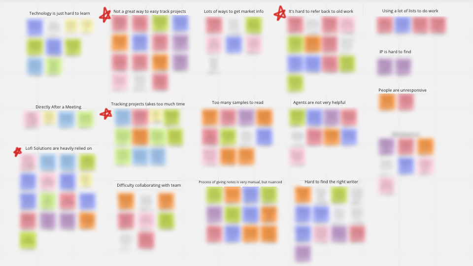
UNDERSTANDING WHAT TO SOLVE FOR FIRST BY FINDING QUICK WINS
Since this was a MVP for a Proof of Concept — the team wanted to make sure we were centralized on a few key features that addressed existing problems in the space.
PAIN POINT #1
Copying from Email Wasted Time
Manually copying details from an email to a spreadsheet wasted valuable time, and forwarding the message made copying someone else’s problem.
PAIN POINT #2

Too many tools
With pen and paper, email, and a variety of CRM platforms in use, Hollie acts as a universal central of truth between studios, teams, and individuals.
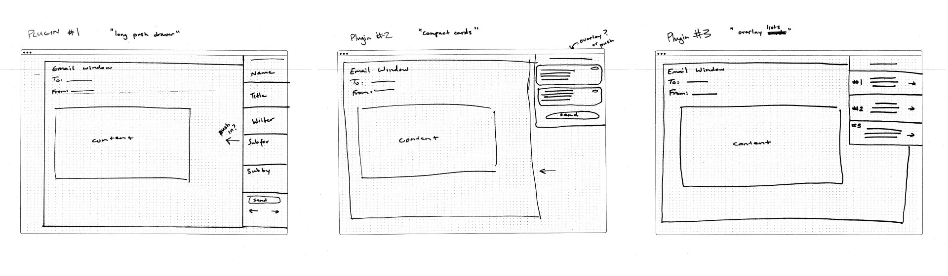
IDEATING ON DESIGNS
Plugin Layout
Since the research showed that most users were copying and pasting their emails or simply writing down their information while looking at their email, the plugin needed to keep users in the browser, so they could easily reference their email in a way that felt familiar to their existing workflow.
App Layout
After using the plugin, the data is then sent to a personal sheet on the desktop app. We explored different ways of organizing the layout, paying special attention to the way users could view their submissions in a way that felt familiar — yet created a simplified center of truth.
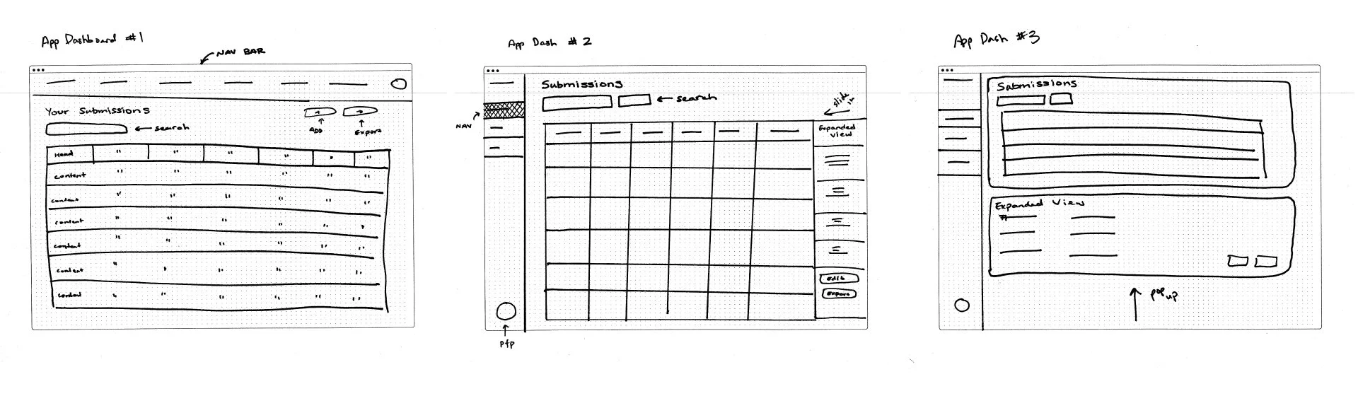
INITIAL DESIGNS
Plugin Layout
Since the research showed that most users were copying and pasting their emails or simply writing down their information while looking at their email, the plugin needed to keep users in the browser, so they could easily reference their email in a way that felt familiar to their existing workflow.

App Layout
Since users were used to tools like Excel, Evernote, or were using internal content management tools, we wanted the app layout to feel familiar and easy to read.

We tested a group of 25 users to gather feedback on our initial designs to see where we could improve
USER TESTING AND LESSONS LEARNED
KEY TAKEAWAYS
88% of users
Users felt that the plugin flow looked cluttered and overwhelming.
68% of users
Felt frustrated that they couldn’t create larger sets of notes.
Users asked for dropdowns to sort lists rather than search.
52% of users
24% of users
Users felt that the plugin flow operated too quickly.
REDESIGNING HOLLIE FROM FEEDBACK
Creating Stage Indicators
Since 24% of users felt that the plugin process moved too quickly — we decided to create stage indicators as well as a loading animation so users could understand where they were in the process.
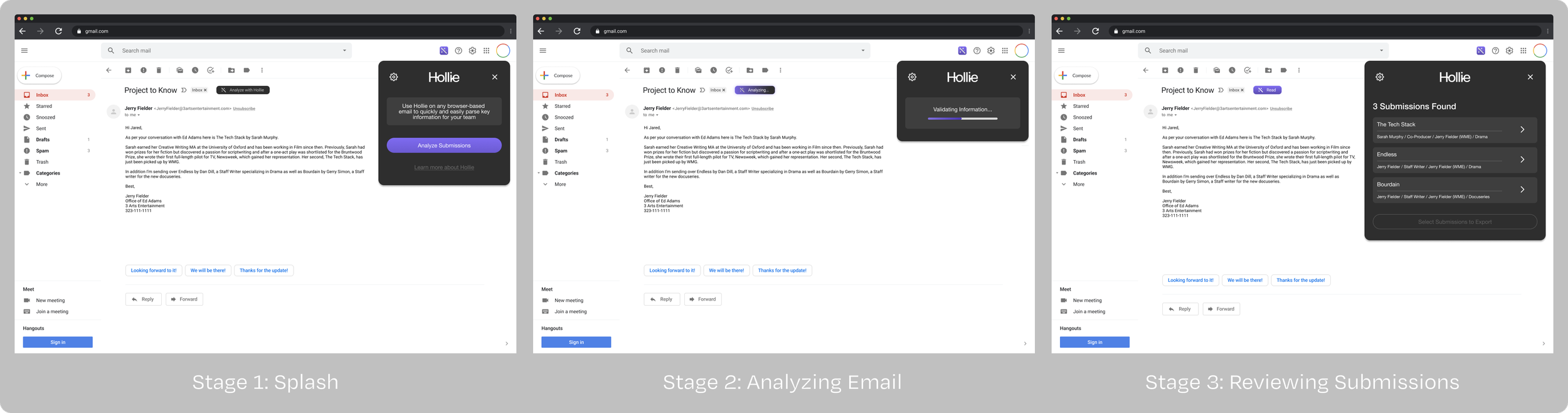
Giving the card room to breathe.
Since 88% of users felt that the design was overwhelming — we decided to create a new card format for the results.

Creating Dropdown Menus to make searching easier.
Since 52% of users said they were expecting dropdowns for each category to filter results, we included dropdowns in the new dashboard.


Users had issues creating large sets of notes in the existing notes section.
We decided to create a drawer to house all additional information that might be too big to fit into one line. Users wouldn’t feel overwhelmed by text while viewing their notes.