

Connecting with Friends. Made Simple.
Project Overview
The Problem
Spotify does great with adding friends from Facebook but doesn’t provide a lot of ways to interact with them after adding them. Sharing music uses 3rd party services like SMS, which seems to skip over the idea of adding friends in the first place.
Project Goal
Create a user experience within Spotify Desktop and Mobile with integrated messaging and more ways to connect with friends online.
Tools Used
Figma, Miro, Pen and Paper
My Role
UX Designer
User Research
Discovering Pain Points
Given that I had limited resources for conducting user research during the pandemic, I took to the internet to help me learn more about the users I was designing for. Discussing with users on r/Spotify and across Instagram polls helped me understand what users struggled with while using the app.
Organizing Forum Responses

I created an empathy map to understand from multiple perspectives what prevented users from feeling connected to their Friends in Spotify.
I found that users feelings were stemming from with 3 main concepts:
Existing Friends list functionality
Sharing using SMS
Creating meaningful connections through music
Current Sharing Process

To share a song, podcast, or playlist on Spotify’s Mobile App users have to complete each of these 5 steps:
Click on a song
Click Share
Click on the method they want to share with
Type in their contact name
Click Send
This process takes valuable time away from the user and doesn’t take full advantage of Spotify’s pre-existing friends feature.
What are the main pain points?

Sharing Music Took Users Away from the App
The process of sharing a song or a playlist wasn’t taking advantage of their existing friend list on Spotify and instead relied on SMS from a user’s phone. It takes 5 clicks to complete for sharing one song, podcast, or playlist.

Friend connections felt hollow
While Spotify allows you to add friends on Facebook and see their listening activity, users online mentioned they wanted more ways to interact with their friends, especially during the pandemic.
Distilling my Research
Personas
Next, I decided to create a couple of personas based on the user insights I had gathered during the research phase. This helped me focus on and visualize the pain points I discovered earlier.


User Journey Map
After creating my personas, I used all the information I had gathered so far to make a user journey map. This map focuses on sharing music within the app since that was the biggest theme users had mentioned throughout the research process.
While this user journey was great for getting the ball moving, I didn’t end up including these exact steps.
I instead pivoted to designing a messenger feature that combined my initial idea of sharing music and added a personal feeling for users to stay connected.

Creating the Design
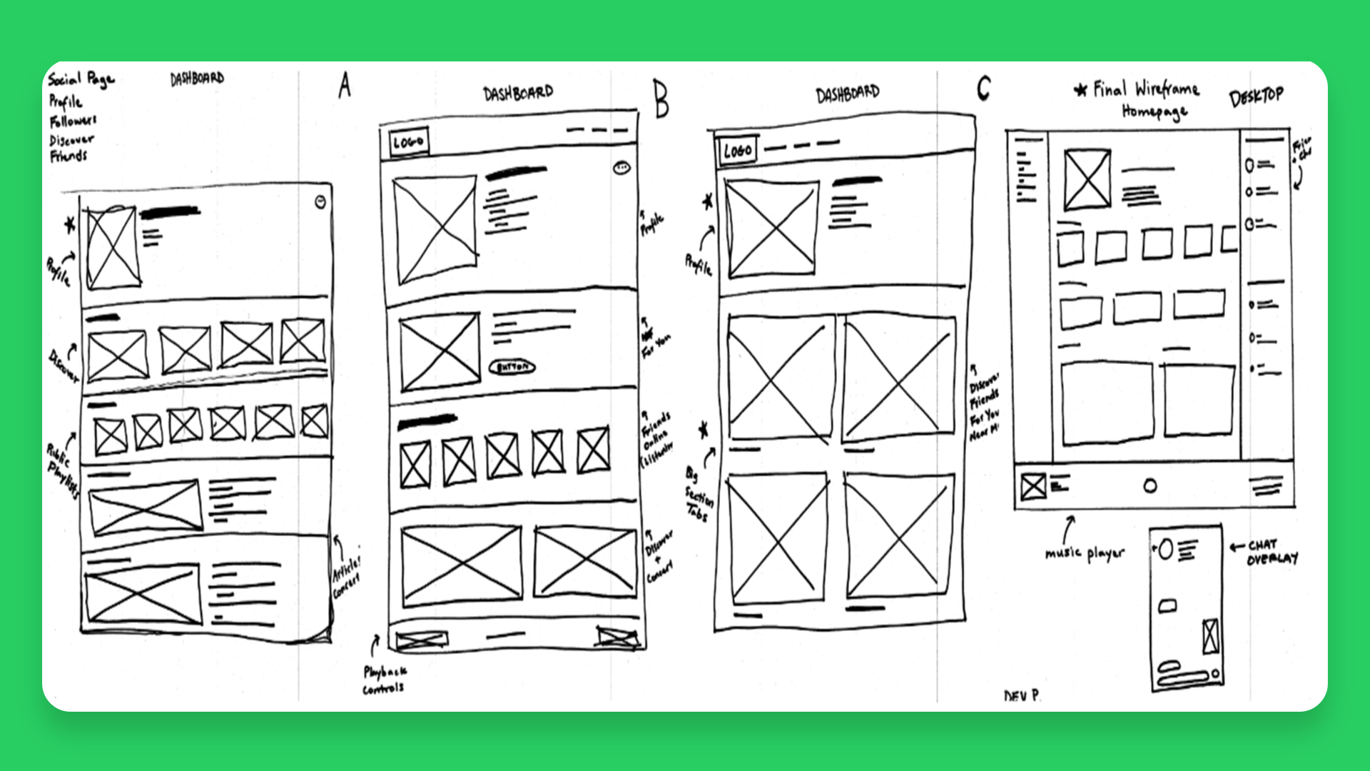
📝 Paper Wireframes
I decided to go for the desktop option first since I knew that part of the design would have the most components and features. It felt a lot easier to exclude items than to include new ones as I progressed.
Working on paper also is one of my favorite ways to ideate since it feels very low pressure, and it helps me stay away from getting stuck in the weeds of pixel perfection.
💻 Low-Fidelity Prototype

While creating this prototype, I wanted to make sure two key features that addressed immediate user needs were ready:
Ability to send music and messages in Spotify Messenger
Creating an interactive component for users to navigate the app
I decided to create copy for the chat and interactive components for the navigation, so that way when I moved to the High-fidelity prototype, I could save time and jump straight to fine-tuning my interaction designs.
I learned a lot about creating smooth animations, drafting provisional UX copy, and creating component systems that aligned with an existing design system.
Mockups


Here are a couple of key features I added that were designed to connect users and create deeper social interactions:
Global Footprint allows users to see where their favorite artists are from, giving friends who view their page more reason to stay and explore.
The Friend Map, located on the new Friends tab helps a user see where their friend is listening to music in real time.
The Genre Breakdown lets a user know what type of music their friends are listening to in an easy-to-digest and colorful pie chart.
Song Streaks is a way for users to keep track of how long they’ve sent songs to their friends. Gamifying social interactions felt like a fun and new way to create an engaging experience that would keep users coming back.
High-Fidelity Prototype
Key Features:
Reduced time for completing a messaging task by 40%.
Added more ways to connect with other users (Global Footprint, Friend Map, Friends Page)


Outcomes
Impact
This redesign brought a new way to share music with users on Spotify. What used to take 5 clicks on mobile and desktop now takes 3.
In addition, I sent this prototype to users who had completed my initial survey as a reward for their compensation, and many mentioned that they wished Spotify would come out with a feature like this soon.
What I Learned
Creating Spotify Social helped me understand the process behind the design decisions a large company like Spotify has to navigate daily. Having a limited amount of personal research and acting upon the insights I had gathered alone definitely influenced the outcome of the design. Working with a team is so essential, especially with large-scale services like Spotify.
What’s Next?
Iterating on the chat function to include greater parts of the user’s library, or an integrated search functionality.
Expanding on the idea of connectivity to allow for commenting on pre-existing group Spotify features like Blends and Group Playlists.
Creating more ways to connect with Friends publicly like live streaming listening sessions that integrate into Twitch or Instagram Live.